Here is another drawing I did, I thought it would be fun to put a bunch of pixelated owls in the background so I did. Make hooting noises and annoy your neighbors.
Wednesday, September 28, 2011
Sunday, September 25, 2011
Turtle study
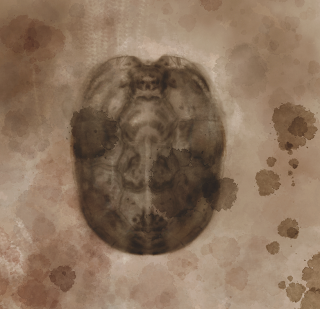
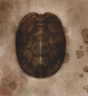
So I've recently been playing with Corel painter 12. This program, floods you with different brushes and styles and I decided that I would do a study of my turtle, Osca. I think that digital media is the hardest to master, and being so far from mastering it myself, I thought that I would just share my process even if I don't know what the heck I'm talking about.
I made a light colored canvas layer. With watercolor you always start from light to dark, which is contrary to other painting mediums. The same goes for digital painting when trying to recreate the look of watercolor.
Second I added some more texture, admittedly I added some texture in later on this same layer when I completed the turtle.


Here I added legs and head, I followed the same process as above, making tones first and following up with detail.
above is the difference between Corel painter 12 and Photoshop. This is the most dramatic difference I've seen between the two when loading the same file into the two programs. In Corel painter, the layers used were 'Gel' Layers, when in Photoshop they opened as 'Darken'
Layers. You could tweek the difference though. I just thought I would include it, so you could plan on there being a difference. Try the program out for yourself and tell me what you think. Have fun with your masterpieces
I made a light colored canvas layer. With watercolor you always start from light to dark, which is contrary to other painting mediums. The same goes for digital painting when trying to recreate the look of watercolor.
 | ||
| Textured canvas |
Second I added some more texture, admittedly I added some texture in later on this same layer when I completed the turtle.
 | ||||||||||||||||
| texture layer |


Above I made one shell layer with tones (left) and then a detail one on top of it. This was the easiest part, since I used the symmetry tool I could do twice the work in half the amount of time.
Here I added legs and head, I followed the same process as above, making tones first and following up with detail.
above is the difference between Corel painter 12 and Photoshop. This is the most dramatic difference I've seen between the two when loading the same file into the two programs. In Corel painter, the layers used were 'Gel' Layers, when in Photoshop they opened as 'Darken'
Layers. You could tweek the difference though. I just thought I would include it, so you could plan on there being a difference. Try the program out for yourself and tell me what you think. Have fun with your masterpieces
Sunday, September 18, 2011
Poster Time.
Here is a poster I did for Spencer Russell. The guy on the poster doesn't want you to miss it. You should listen to him. He knows best. Other people will be there too. He's aware of that.
You have one week to prepare for this show. I bet you could find enough pennies in seven eleven parking lots to get 2 dollars by next Saturday. I'll see you there.
You have one week to prepare for this show. I bet you could find enough pennies in seven eleven parking lots to get 2 dollars by next Saturday. I'll see you there.
Saturday, September 17, 2011
Depressing
This is touching on a darker subject. I may redo this piece in the future, to make it read a little better but I thought I'd share it with you.
p.s. I'm not depressed.
p.s. I'm not depressed.
Sunday, September 11, 2011
Here's a gnome sketch
I saw this little guy running away from the sun, but then he tripped and hit his head on a rock. His brain was scattered everywhere. Rest in peace little gimp.
Friday, September 9, 2011
Sunday, September 4, 2011
Not much is too much
Thursday, September 1, 2011
Summer Has Ended
Subscribe to:
Comments (Atom)


